ShopDreamUp AI ArtDreamUp
Deviation Actions


Suggested Deviants


Suggested Collections


You Might Like…


Featured in Groups


Description
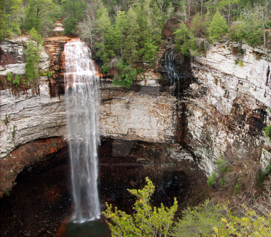
Another Fall Creek Falls photo
As you can probably tell, it is a crop of my previous submission.
The contrast has been messed with, and it's more vibrant. Perhaps too vibrant. As I said before, I haven't gotten the hang of Photoshop yet. I felt like it might've needed to be tuned down a little, but I'm still working on that part. I just used Smart Fix, and this is how it turned out.
Please excuse my new-found ignorance of the ways of Photoshop.
Sorry about the watermark, but I don't have my signature on it yet. Pretty soon I'll do that and take off the watermark so people can download it if they want.
Also, the date is wrong. This was really taken on February 19th, 2011.
Image size
2502x2184px 1.07 MB
Make
General Imaging Co.
Model
A730
Shutter Speed
1/120 second
Aperture
F/2.8
Focal Length
6 mm
ISO Speed
80
Date Taken
Oct 16, 2007, 8:19:42 PM
© 2011 - 2024 PineLakeReveries
Comments2
Join the community to add your comment. Already a deviant? Log In
This looks good, you're moving in the right direction.
I do not find this too vibrant. I find I usually want to increase the contrast and vibrancy a little in most of my photos. I like to stay away from saturation, as that usually ends up looking messy.
I like this crop. The action of the falls is along the left third of the photo, which makes it more balanced. I also like that you've not got sky in the shot, and the horizon, such as it is, is in the top of the photo. This is a nice shot, well done.